Kombucheriet
Kombucheriet needed help with redefining their brand language and a new label that made them stand out from their competitors.
Kombucheriet needed help with redefining their brand language and a new label that made them stand out from their competitors.
Graphic designer
Kombucheriet, a kombucha brewery located in Bagarbossen in Stockholm, came to Hyper Island to get help with their graphic profile. They had made several attempts to rebrand themselves prior, both in-house and with external consultants, but felt that their current bottle label didn’t “pop off the shelf” as much as they wanted to.
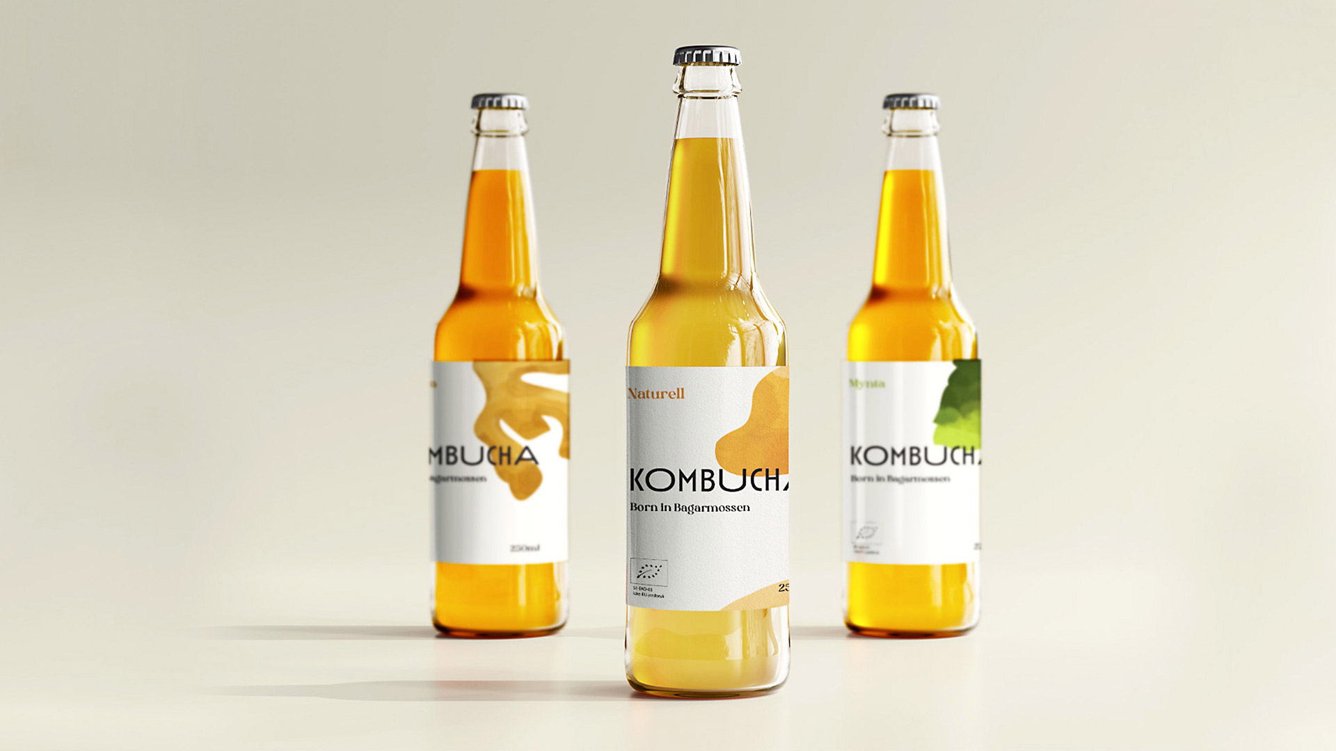
The client wanted a label and graphic profile that clearly displayed their local Bagarmossen roots, with a lighter and cleaner bottle label than their competitors. They also wanted a scalable concept to implement on future products, both new kombucha flavours as well as other goods.
Challenge
Early on we realised that we had a somewhat daunting task in front of us; we had no idea how the current kombucha-climate looks like.
After researching how that climate looked like, by rigorous Googling and buying kombucha from every brand we could find, we started to map the current trends and develop our initial ideas. As the client instructed us to not go too far from the current brand landscape, we really pushed ourselves to not go overboard with our new designs.
After 4 weeks we presented 3 directions for the client to choose between, the one they wanted to continue with had a calm colour profile with a plethora of beautiful, minimalistic illustrations.
Challenge
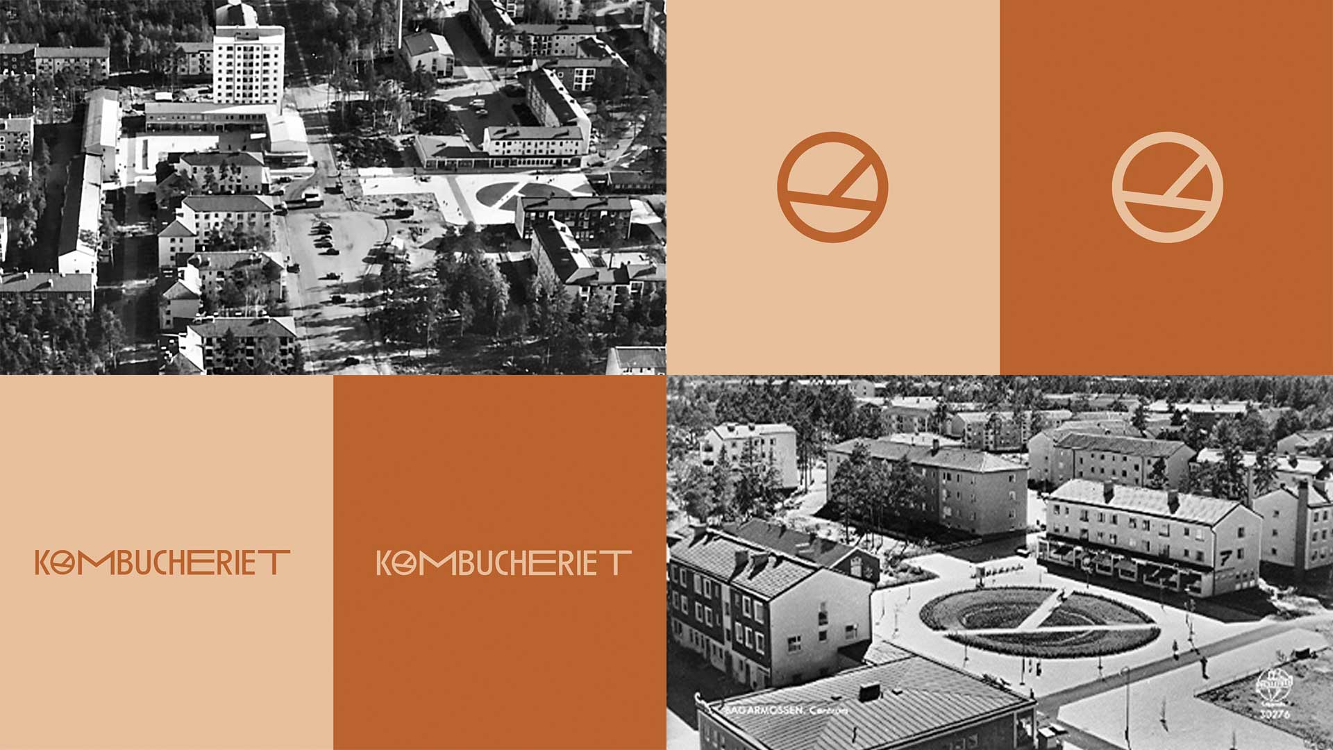
The roots of Kombucheriets brewery in Bagarmossen was something that the client early on showed great love for. The client frequently brought up that they always turned to their neighbours and locals for input on their new flavours, since they have always been their biggest fans and supporters. Our new design language was no exception to that valuable feedback.
With their strong roots in mind, I managed to dig up several old images of how Bagarmossen centrum looked like in the old days. Back then the central square garden had a quite distinct round shape with walkways going through, which caught my eye. An iconic shape lost in time now fueled my logo design.
With a clear homage of the old; a new logo was born.
Challenge
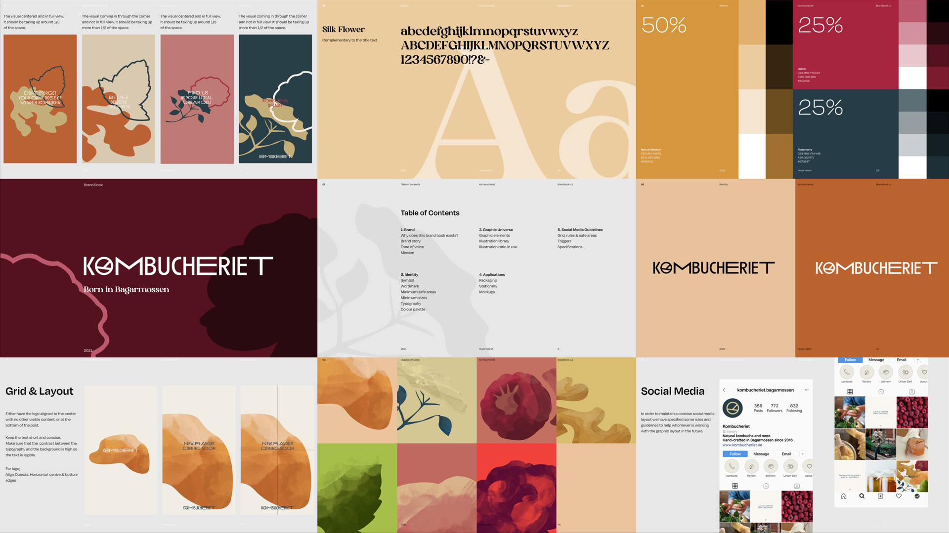
Together with the client we developed the brand book for them to aid them implementing our new design language. The brand book contained guides and visuals concepts of typefaces, colours, illustrations, logotypes, imagery, layout grids, social media, merchandise and more.
The focus of the brand book was how to implement our design language with Kombucheriets current lineup of products, but we also went a bit further and made design examples of how it could look like with future products not yet launched.